Wednesday, November 04, 2009
Graphs that make you go hmmmm
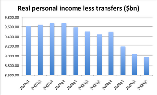
 I do a number of local talks in town, usually a couple per month, but for some reason I hadn't done any big ones in the last six weeks. So when I was prepping for this morning's talk to the collected Rotaries of the area, I had to put some new slides together. Whenever I do this, there's one that tells me something I did not realize before. The one above is this months thing-I-didn't-know-before.
 During each of the second and third quarters, the Making Work Pay Credit provision lowered personal taxes and raised disposable personal income about $50 billion (annual rate). During the second quarter, ARRA provided payments of $250 to beneficiaries of social security and other programs that raised disposable personal income about $55 billion. ARRA also provided special government social benefits for unemployment assistance, for student aid, and for nutritional assistance; these special benefits raised disposable income about $49 billion in the third quarter and about $35 billion in the second quarter. ARRA also funded current grants (such as Medicaid) and capital grants (such as highway construction) to state and local governments of about $75 billion in the third quarter and $85 billion in the second quarter.How much of our third quarter GDP growth is due to this stimulus? Maybe more than we think. But how long will it last? Harder question. What I know is that after looking at this graph, I have a harder time finding the trough of the current recession. Both income and employment declining? I know monthly GDP turned positive in July (only 2 months of data so far), and I know there are revisions to the data forthcoming. So I could be wrong, but I need more evidence before I start thinking the national economy reversed.
UPDATE: Looking at James Hamilton, I see he has the monthly disposable personal income graph. But that has all those transfers, like the $250 checks to seniors, included in it and I think that view is distorting the underlying trend. Look at page 6 of the monthly income and consmption data report (published last Friday.) I'm looking at the line labeled "Personal income excluding current transfer receipts, billions of chained (2005) dollars" -- it's the last boldfaced line at the bottom of that page. That pulls out the effects of the stimulus. If the economy was getting better, wouldn't that number be rising? Or am I just asking for too much?
Labels: economics, forecasting


