Friday, September 05, 2008
Graph of the day
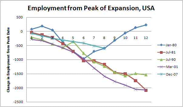 With today's employment report we now have eight consecutive months of employment decline. Let's assume that the beginning of the decline marks the beginning of a recession, setting the peak at December 2007. Where would this recession compare to other recessions for employment loss? The graph to the left shows cumulative employment decline for this and the previous four recessions. Three were much sharper -- the fourth, from the January 1980 peak, shows a pick-up that coincides with the 1980 election period. You might hope we get that one, except it was followed by a change in presidential administration and a second recession in the middle of 1981.
So far, still a relatively wimpy recession. Is it perhaps labor hoarding again? I keep getting anecdotes up here about part-time workers having a very difficult time finding jobs, but full-timers doing better (particularly in retail and hospitality.) Like I say, only anecdotal, but it might fit this data.
Labels: economics