Friday, January 14, 2005
More fun with cardinality
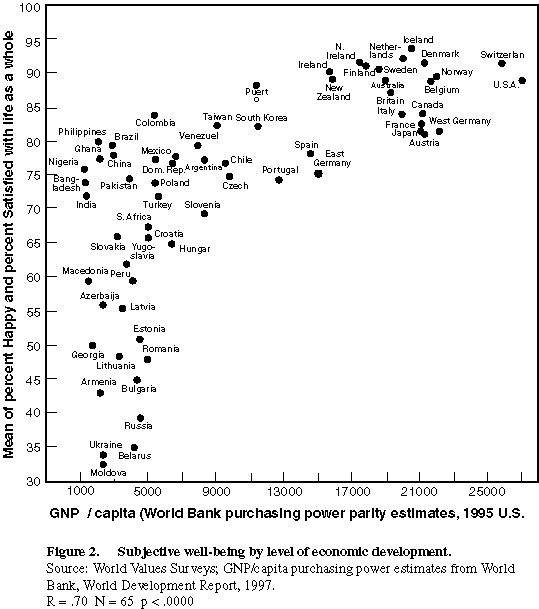
The vertical axis is the result of two questions done in the World Values Surveys of 86 countries asking whether people were "happy" and whether they were satisfied with life. The horizontal scale is the standard of living in these countries as measured by per capita income.
Now the thing the researchers always point out is the decreasing slope of the line that describes that scatterplot -- adding much more to your GNP per capita doesn't add that much to your happiness. Of course, if you were to make the graph log-linear (log of (GNP/capita) vs. happiness) you might get back a straight line, indicating happiness increases with a percentage increase in your income. Not sure what the issue is there.
But the thing that bothers more is what the heck that vertical scale really measures? What does it mean to be 3-happy versus 4-happy? How can you compare happiness across different cultures?
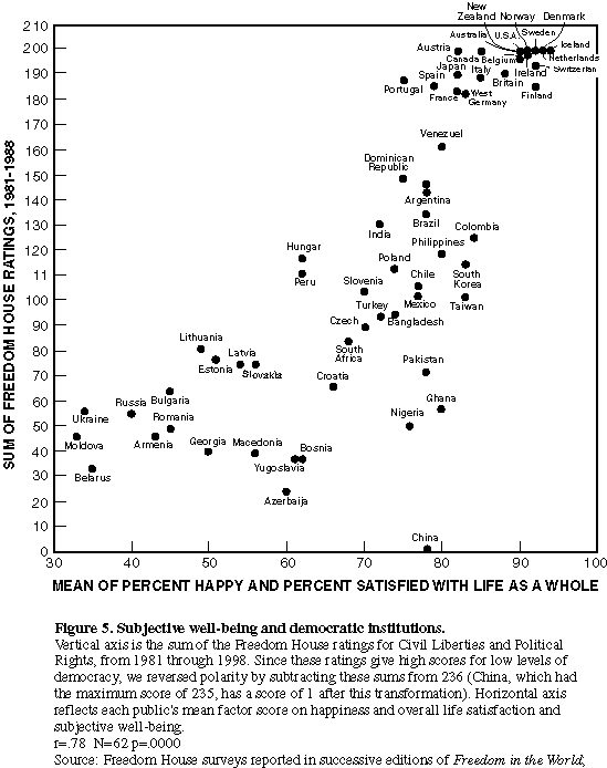
Try this graph as well. Does happiness increase at an increasing rate with democracy? What does this graph mean?
So question is: why is it OK to use a cardinal scale to represent happiness?