Friday, October 15, 2004
Some economics notes this week -- silver and gold linings
"So far this year, the rise in the value of imported oil -- essentially a tax on U.S. residents -- has amounted to about 3/4 percent of GDP," Greenspan said. Imports subtract from gross domestic product, the broadest measure of the economy, while exports add to it.I have argued for awhile with some of my local colleagues that the effect isn't all that large. I run a model on the side for the national economy (I haven't done any updates publicly for a year as it's largely meant as a teaching tool for our masters students, not as a product I offer to anyone -- but in writing the QBR I want to peek at what that model says to me) and my forecast was shaved about 0.6%, partly because oil prices are part of the forecast, and I already was pointing towards $40 oil based on what had happened with gold prices. UPDATE: The Wall Street Journal says as well that $45 oil is already factored in:
The economists estimated that crude oil in the $40 to $49-a-barrel range shaves their GDP forecasts by just 0.1 percentage point. They said a rise into the $60-to-$69 band would lead them to mark their forecasts down by nearly one percentage point. Crude-oil prices have traded above $40 a barrel in New York since July.So the thoughts that the rise in oil prices would harm Bush's election chances probably don't matter very much. Economic models are still predicting a rather resounding Bush victory. And don't listen to this bit of namby-pamby:
Mark Zandi, chief economist at the company, is skeptical. "The economy is losing momentum going into the election, there is a lot of angst among voters. The models may not be picking that up," he said.Angst? Rubbish. That's a forecaster engaging in CYA. We all do it; we always want to shade our models towards the other guy's models to be sure we're not too much of an outlier. Another benefit of being an academic: I don't get fired for giving a bad forecast, because nobody is betting money on the basis of what I say.
At least, I hope not.
Of course people will take the statistics and try to scare us. They continue to paint the employment numbers as bad, and I even fell into it a little last week. Gene Epstein had a great column in Barrons this past week (subscribers only, sorry) in which he looks beneath this household/payroll employment survey imbalance and sees something more positive:
In other words, rather than the household survey overstating current employment, perhaps the loss of payroll jobs (that the Kerry campaign continues to cite) was the result of an overstatement of paycheck jobs in the late 1990s, a statistical artifact. The Cleveland Fed article he cites contains this graph which shows how the adjusted figures (after accounting for differences in international migration patterns, for example) flatten out the size of the decline:There is a cyclical pattern to the employment data economists have noticed but can't explain. In a boom, payroll employment rises faster than the payroll-equivalent number in the household survey. When the bust happens, the gap closes, as payroll employment falls faster. The cause, as I see it: the cyclical movement, at the margin, from cash jobs to paycheck jobs during the boom, followed by movement of paycheck back to cash during the bust. Cash-economy workers are lured, at the margin, into paycheck work by employers eager to hire, and then are forced to take cash work again when payrolls are cut. Nine-to-five paycheck workers who moonlight at second and third jobs probably do the same.
But while the household survey makes no distinction between cash and paycheck work -- a job is a job -- the establishment survey does. During the boom, the establishment survey starts counting jobs and workers it never knew existed; the vaunted universal count falls into the same trap. In the bust, both sets of books start losing these jobs, but the household survey is relatively unaffected.
Now, during the hiring frenzy of the late-'Nineties, you would have expected the same phenomenon, in spades. The payroll figure was nearly 2 million higher than the household figure; the two merged early this year. The fall in the household figure reflected what was really lost, not phantom losses.
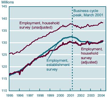
What Epstein proposes is that, in fact, the adjusted household survey line (the lowest of the three) is the correct picture. If so, employment has actually grown since the start of the recession. One fact worth noting: the 236,000 figure I gave last week has a standard error of 140,000. The estimate variances are quite wide (source: the memo obtained by the WSJ last week, available to subscribers here.)
Elsewhere, the retail sales figure came in quite nicely, though most of the surprise increase was due to auto sales in September being much better than expected. Ex-autos, the increase was 0.6% vs. 0.3% estimates. So consumer spending is looking stronger, even if the Michigan consumer confidence number doesn't. Elsewhere are some weaker signals: industrial production worse than expected, producer prices about in line. I'm guessing much of that is the hurricane. The trade deficit probably is going to drag on the third quarter GDP number, but if these consumer spending figures hold up I still think my call of 4.2% for third quarter GDP is good, and we're still looking like 3.75% for the year.
Those still interested in the electoral futures market: Bush is trading at Tradesports around $.55, down a dime from before the debates. My Kerry shorts are underwater, but I'm holding them for the duration at this point. The bleeding appears to have stopped on the Iowa market. And there's heavy positive Bush action on the Minnesota contract at Tradesports, at last.


