Wednesday, September 22, 2004
Not all McJobs
The September FedLetter from the Federal Reserve Bank of Chicago has an interesting graph showing the increase or decrease of employment since the beginning of the year.
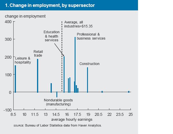
...across a variety of payroll survey calculations, job growth seems to be occurring in high- and low-wage sectors in a fairly typical way given where the economy is in the employment cycle.The authors note that while the graph above looks like most of the growth is in above-average wage areas, finer breakdowns of the industrial areas (2-digit NAICs instead of 1-digit, if you really must know) make the pattern look less positive. Still, the Kerry claim that job quality has been poor during the expansion is at least debatable; this expansion has been quite normal in the quality of jobs generated.